Everyone has come across a landing page, whether they’ve known it or not. Ideally, a visitor will get all the information they need from that one page, and decide to make a purchase, commit to a subscription, or some other action.
These pages are usually the final destination after clicking on an advertisement, or following a pathway through a variety of blog posts. However, they can also be the homepage of a site or a page for a specific product or service.
Ultimately, every webpage needs careful consideration when it comes to design, content, and other page elements. How you manage these aspects of your pages can substantially impact the success of your business. So, it’s well worth taking the time to brush up on a few practices that will timelessly apply to all of your landing pages.
Best Practices for Visual Cues and Design
Visual design deserves a lot of attention, but really how much variance can you get on a webpage? Although it seems that in the modern days of the internet, everything kind of looks the same, minor differences can have a massive impact.
1. Let Simplicity Rule Your Design
Simplicity continues to reign supreme, but some brands just aren’t getting the picture or removing them for that matter. When it comes to simplicity, you’ll need to use your best judgment.
Simplicity in design will impact key landing page metrics such as your bounce rate, average time on page, and ultimately conversions.
In the examples below, we see Dollar Shave Club, a growing startup that offers good-quality razors on a subscription model, compared to Schick, the razor titan, which also has a subscription service.
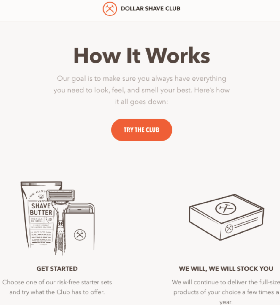
Source: Dollar Shave Club
The design here is simple. There aren’t colorful images, the CTA is the only brightly colored thing on the page, the images are minimalistic, and the text nearly matches the background page color. Overall this page is screaming, “Don’t even read the words, click on the orange button!” So what are the stats on this page? Performance-wise, this page sees an average of 4.8 views per day, with a 38.2% bounce rate, and the page visitors spend about 3 minutes and 25 seconds on the page. These stats are great. Because the longer that someone spends on the page, then they are less likely to bounce.
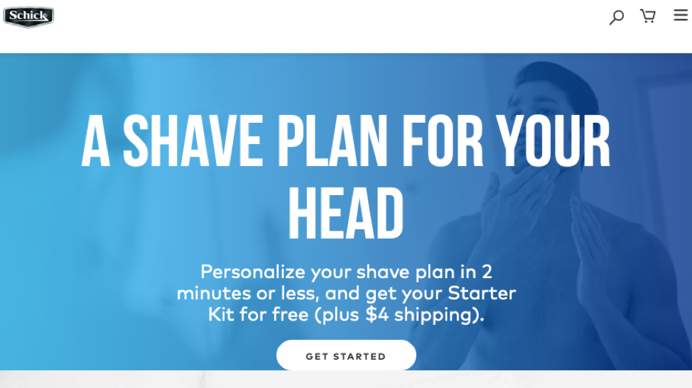
Source: Schick
Schick’s landing page for their men’s shaving subscription has a 42.4% bounce rate, people spend about 1 minute and 30 seconds on the page, and the page gets about 1.8 views per day. That’s abysmal compared to the Dollar Shave Clubs landing page, and a major contributing factor is an over-complicated design on Schick’s landing page.
2. Rely On Color Theory to Incite Emotional Responses
We live in color, and it subconsciously rules many of our decisions. Restaurants use colors that make us hungry, happy or incite comfort. We’re looking at you McDonald’s, KFC, Panda Express, and so many others that use warm colors to tempt the masses.
You can use this same connection between color and emotional response to boost your conversions and decrease bounce rates.
Color can increase site recognition by 80% with a focus on darker color schemes resulting in a 2% growth.
Think of Facebook’s calming blue, or Snapchat’s happy yellow. These colors are in place because of their connection to particular emotions. Give some time and thought to color theory when designing your landing pages.
3. Clean Design Leads to Higher Conversions
Going beyond the simplicity of the page, the cleanliness of the design takes on a few other factors. Clean design means that things are easy to navigate, manage, and are generally very direct. They focus mostly on everything above the fold.
Google is a prime example of clean design, and its unchanging nature helps to reinforce that because it’s reliable and has only the buttons or information necessary for the visitor. Excluding the fun and engaging Google’s Doodles.
4. Give Directional Cues to Guide Visitors
Think of every element on your page as you would a directional sign in an office building, hospital, or parking structure. It should all serve to direct your visitor toward the call to action. Everything must funnel down to that CTA, but it must do so in a minimally invasive manner.
Use images, specifically custom-designed images that can send attention to one spot on the page.
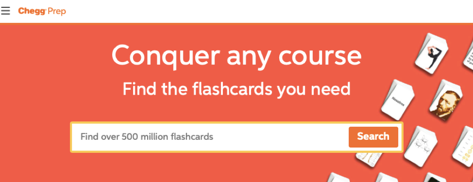
Source: Chegg
Chegg’s page for flashcards uses the side images to direct attention toward the search button itself. Clever directional design can engage visitors.
5. Consider the Proximity of All Page Elements
Department stores dedicate entire teams of experts to decide how products will sit in relation to one another; this is proximity planning. You should put that same level of planning into your landing pages. For many people, it seems like too much work to put that planning into every single landing page when a company many have 10, 15, or more landing pages on their site. Businesses with 10-15 landing pages have seen conversion increases over 55%, while companies with 40 landing pages can see conversion improvement by about 500%.
When considering the proximity of your page elements, it’s best to have a few guiding rules for your design team, or you if you’re the one crafting these pages. A few simple rules will allow you to implement this best practice without spending hours worrying over detailed aspects of each page.
Consider these guiding rules:
- Center your call to action
- Pair your call to action with a required field (email, etc.)
- Use the reverse pyramid visual structure
- Pin your logo in a top corner, and balance the other side.
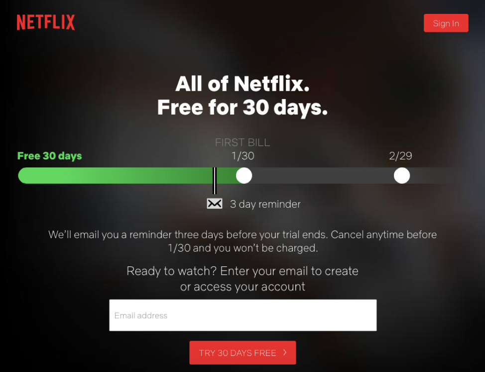
Source: Netflix
Netflix’s initial page, which acts as its primary landing page, is in the shape of an upside-down pyramid where it all boils down to that free-trial button. When it comes to proximity, you’ll notice that the giant email field gives the impression of having a lot of white space around the CTA.
Something important to mention here is that you can use proximity to address commitment fears. In the Netflix example, they use their primary space to show that they present a 3-day reminder before your first bill becomes due.
6. Use Only Non-Distracting and Brand Associated Images
Images can have a huge payoff, or wreak havoc on your landing pages. While many people worry about the associated risks of images, such as delays in loading times, the primary concern is the initial visual element. Is your image distracting? Is it taking away from the message you need to convey to your visitor?
Use images that are directly relevant to your brand as a whole, rather than the singular product. The only exception to this principle is providing images or sketches of the product; that’s a little different.
Ultimately, if you feel that an image could be distracting and you want to avoid it but include a visual aid, you can opt for a minimalistic image such as in the Dollar Shave Club example shown earlier.
7. Eliminate All Visual Distractions
Navigation bars, ads, and more are all visual distractions that pull away from your 1:1 ratio. When designing landing pages, you want every visitor to give 100% of their attention to what is on the page. That means you’re aiming for a lower standard deviation than what is acceptable in Six Sigma practices. It’s the goal of perfection, and it’s a noble goal.
To get yourself closer to obtaining all of your visitor’s attention, you need to make it as easy as possible, and that means removing all distractions.
Remove navigation panes, links, and any other place to click on landing pages. That means removing the option to enroll in your email newsletter on the sidebar, your social links, and your footer.
Ideally, you’ll have a 1:1 ratio on all of your landing pages, which is a links:page ratio. Your home page might have a 25:1 ratio, and blogs might have a 7:1 ratio, but all of your landing pages should have a 1:1. The great thing is that you don’t need a fancy online tool; simply ensure that there is only one link on your landing page — one link, which should be your CTA.
Best Practices for Forms, Fields, and Interactive Elements
Forms, fields, and other elements that promote interaction can engage customers in a way that many landing pages simply can’t. The problem is getting these elements right because if you don’t hit it right on the money, it can be devastating for your page. That do-or-die component has led many people to avoid them altogether.
8. Implement Forms
There’s a massive misconception that people hate online forms. While it’s true that not everyone is a fan of forms, many people don’t bounce off the page simply because there is a form present. Give your customers the benefit of the doubt that they know you need some information to start their service.
Web forms with five fields produce the highest conversion rates, and multi-step forms available in WordPress can boost conversions by 300%.
There are a few rules to help you start using forms. First, never ask for more than you need. Don’t get greedy when it comes to customer data. Second, give white space. Finally, provide a CTA at the top and bottom of the form.
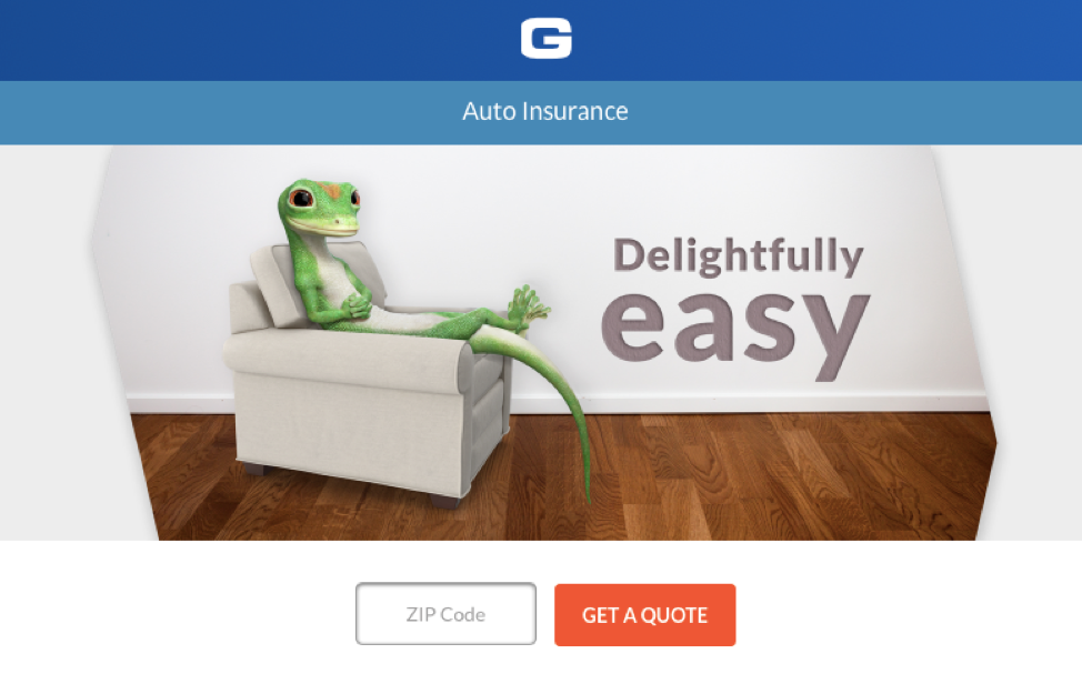
Source: Geico
Geico here does need some information because their prices begin to vary based on location. At first, they only ask for a zip code. Then, they ask for a little more on the next page where you can begin inputting your name, vehicle information, and factors that may impact your quote. For Geico and many other companies, it’s necessary to know more about the potential customer and forms are the tool for accomplishing that.
9. Give the Feeling That the Work is Already Done
What you want to accomplish here is called “Auto-fill form fields.” You’ll want to allow your visitors to auto-fill from their local storage. Computers, phones, and tablets all store data, and many users will happily complete longer forms if they don’t have to type out the standard information such as their name, address, and phone number.
Unfortunately, this best practice requires a fair amount of prowess as you’ll need to use jQuery, JavaScript, or something similar. Some form creators such as Unbounce allow the site to pull from data the site has already accessed. It gives a small step toward complete auto-filling.
It’s well worth the investment to bring in a developer, or to devote some of IT’s time toward developing these auto-fill fields. Optimizing webforms with auto-fill features can change the game for many companies.
10. Use Hidden Field Tracking
If you’re using ads, then you need to be using hidden field tracking. Not only is hidden field tracking rather easy to use after the initial setup, but it can help you identify which leads are converting. Drilling down into meaningful data like this is difficult for anyone in ecommerce to accomplish.
Hidden fields can track:
- The keyword the user searched before selecting the Ad or landing page
- The user’s stage in the campaign or sales funnel at the time of conversion
- Where the user initially came from (Facebook, Google, home page, etc.)
- And more
The extent of hidden fields is surprising, and the best part is that your visitors don’t know that you’re creepily tracking their activity.
11. Create Explainer Videos
An explainer video is what it sounds like, a video that explains your product or service. Videos on landing pages can boost conversions by 86%, they keep visitors on your page longer, and they give you a more successful method of providing information.
When you have less than ten seconds to impress a new visitor, you can likely give more information in a 10-second video than in a few lines of written content.
Now, videos aren’t right for every page, and they do slow down load times, which is a deal-breaker for some people. Carefully weigh whether a video is a good fit for your page or not. 97% of marketers agree that videos help users understand the products better, and that can not only lead to improved conversions but build trust for your brand as well.
For example, if you’re selling a new electric drill, then you probably don’t need a video. However, if you’re page is for a rather innovative product, then you may need to show how it works. Think of an explainer video as a 30-second to a 1-minute version of an infomercial.
Best Practices Concerning Landing Page Content
Landing page content is a huge deal. It’s your only chance to convince this new visitor that they need to be a customer, and hopefully, a loyal customer. These best practices address content creation, display, and function.
12. Keep Your Copy Clear and Concise
While sometimes it’s fun to put a few distractions in or try to write more engaging content, your landing pages just aren’t the space for that.
Imagine if Apple’s latest iPhone landing page started with, “The future will bring in hovercraft, three-eyed aliens, and of course, great technology.”
That sentence is a huge distraction, and while it’s unique and could get a smirk out of someone, there’s no focus on the phone or phone-related things. But, even something somewhat related such as, “Phones make the world go ’round,” is still distracting.
Why?
It draws attention away and the product, the entire purpose of the page, because many people will read that sentence and think, “Excuse me, what?” rather than, “Man, I want that phone.”
If your copy doesn’t use every single word to sell, convert, or inform, then it’s failing you. Unlike blogs, articles, case studies, and white papers, the landing page must be straightforward.
While very few companies have the brand recognition to pull off “Sign Up” and nothing else, you can minimize your copy to only include the necessary.
13. Make Everything Easy to Read
On average, webpage visitors will take a little less than 6 seconds to review written content. When you consider that an average adult reads between 200-250 words per minute, it’s clear that you have a tiny window to work with here.
To give those numbers some meaning, figure that an adult should read about 225 words per minute or 3.75 words per second. You have 6 seconds to work with or 22 words. Previously content planners and web designers worked with a “15-second rule” in mind, but recent studies show that the 15-second window diminished substantially. In a hopeful world, those 15-seconds would give you 56 words before a visitor made their decision to convert or leave.

Source: HelloFresh
HelloFresh, a subscription-based meal-delivery service, seems like it has a word-heavy landing page. However, when you break it down, the straightforward content and form setup make it more engaging and will likely lead to more visitors reading the page.
Great tools to use to simplify your content and make sure that it’s easy to scan or read are:
- Grammarly – helps identify unnecessary words and offers different word choices
- Hemingway app – helps identify complex sentences
- Ginger – provides basic proofreading but also identifies improperly used words
During a quick scan, a reader will likely only read the headers, and price point text, which in this example is a total of 13 words, well below the 22 word guide for the 6-second glance. When you have headers such as “Choose your preference,” a reader will take that in much more quickly than, “Decide on your dietary structure,” or even, “Select your eating preferences.”
In general, don’t obsess over word count, but instead, focus on making your headers scannable, your content simple, as seen in this example, give some white space, so the font stands out even when it is generally small.
14. Plan Your Page with Persuasive Marketing
Isn’t all marketing persuasive? Ask Quiznos who relied on a marketing campaign that involved roadkill, and seemingly became roadkill afterward.
Persuasive marketing is about more than swaying the opinion of your visitor. It’s about molding the design and content of a page around user motivation and psychological intent.
One great example of persuasive marketing is the impulse sections near a register in a store. Online, persuasive marketing takes on a different form but relies on the same “weapons of influence” deeply rooted in consumer psychology.
Use:
- Reciprocity
- Commitment
- Consistency
- Credibility
- Authority
- Scarcity
When designing your content, using key phrases such as, “3 items remaining” can get someone to convert when they weren’t ready. Additionally, citing information that boosts credibility and consistency can have a considerable impact.
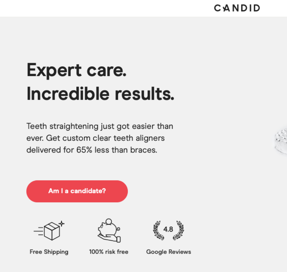
Source: Candid
Candid delicately introduces their 4.8 rating on Google Reviews, which showcases in very few words that their customers are delighted with their service. This little bit of insight shows consistency, credibility, and gives them some authority. They also touch on the pain point of price and offer some reciprocity with their line, “delivered for 64% less than braces.”
15. Utilize Conversation Momentum
Your Google or Facebook ad, headers, landing page copy, and CTAs should have a natural progression of a conversation. Use questions, prompts, and storytelling to engage a reader and to usher them through the sales funnel.
Creating conversation momentum can be done by bringing your content creators and marketing teams together. Align their KPIs, breakdown any communication barriers, and have them work towards the same goals by creating a very staged conversation.
16. Build Your Brand’s Reputation
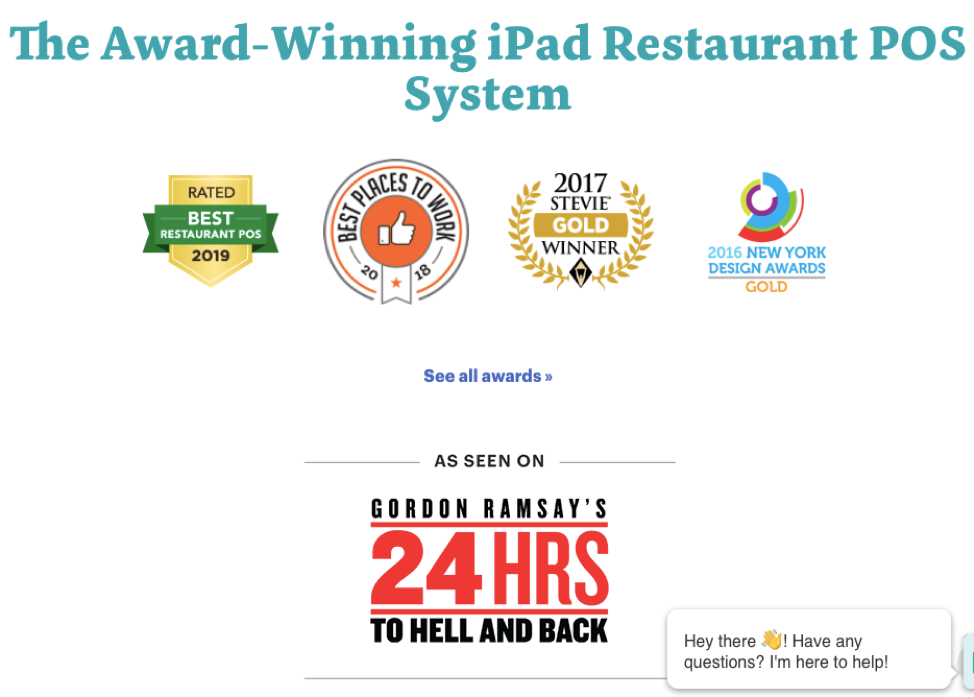
Survey the often-overlooked regions of a landing page for the opportunity to put in some extra work. TouchBistro uses the space below the fold to show off their accolades, achievements, and public recognition. This example comes from their home page, rather than a landing page. However, this tactic shows the same success, regardless of where it sits in the structure of a site.
You can use forgotten areas of a landing page to build your brand’s reputation. Even if you have not yet won awards or landed a mention on a TV show, you can provide a bit of public proof to your claims. If you acknowledge on the landing page that you’re the best subscription doggy treat service, then use spaces below the fold to show off tweets, or comments from happy customers.
 Source: TouchBistro
17. Weigh the Value of Your Headlines
Not every headline is made equal. Headers should deliver a clear feature or benefit. They are not the area to address pain points unless you’re providing a solution as well. If your headers don’t deliver a compelling value proposition, then you’re wasting valuable content space.
There are many examples where companies are successfully omitting headers on their landing pages. Square provides less of a header and more of a statement.
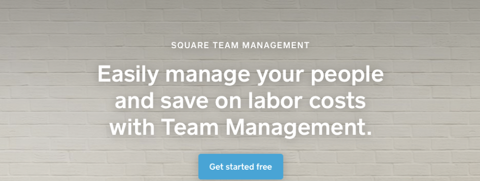
Source: Square
18. Create Compelling Headlines
While you could consider doing away with ineffective headers, you could also create more compelling headlines. There’s a vast difference between “King dies, brother to take place,” and “Mufasa killed in stampede, scar to take over.” The struggle is to balance emotionally charged words with vital information.
Headers have a few if/then statements that can help them remain compelling:
- If you mention a pain point, offer an immediate solution.
“Losing hair is tragic, but hair transplants are here!”
- If you give a surprise to your reader, be honest. (Don’t’ sensationalize anything)
“Bears breathe underwater with new advancements in technology.
- If you are giving incomplete information, always be technically correct.
“Vitamins offer a miracle cure for afternoon slumps.”
Compelling headlines don’t have to lie, bend the truth, or use a tabloid-like voice. You can always create compelling headlines that are true to your brand’s voice and values.
19. Reverse Engineer Your Buyer’s Concerns
You want to address your buyer’s concerns without any hesitation directly. Don’t waste time trying to dive deep into the associated; instead, strike hard for the root cause of the problem.
When writing content for your landing pages works in this order:
- Clearly state your visitor’s pain point, issue, or struggle.
- Offer the solution in big, bold, can’t miss text!
- Showcase the outcome. (Optional)
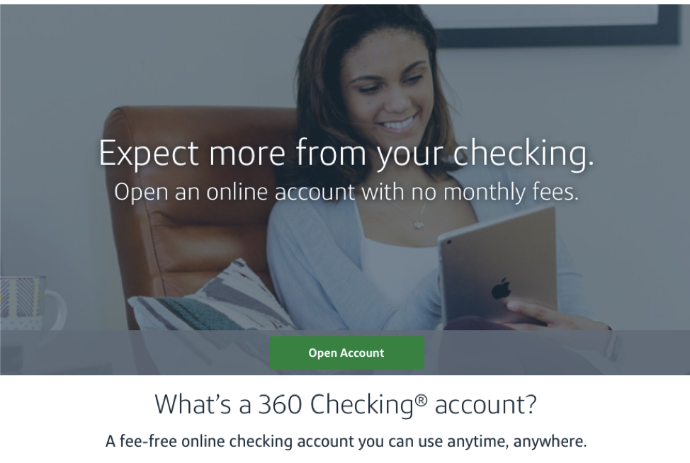
Source: CapitalOne
Capital One promotes its 360 checking accounts by addressing their buyer’s concerns. They weren’t asking, “how can we get people to sign up?” Instead, they focused on why people hate standard checking accounts. They identify the pain point (checking account fees), and addressed it immediately, “Open an online account with no monthly fees.”
Landing Page Practices that Apply in Every Situation
There are always those few principles that apply in every single instance. Landing pages have a few, and you should use these as part of your standard page development and maintenance.
20. Match Your Tone Across the Board
Your tone is a significant part of your branding, and branding consistency can lead to a 23% increase in revenue. That’s not something that any company should take lightly.
60% of Millennials expect consistent branding across all marketing channels and contact points.
21. Capitalize on Your USP
Your Unique Selling Proposition is what separates you from all of your possible competition. Your visitors must understand why you’re different. Try to sum up your USP in a very short sentence that can sit within the content for the final push toward conversion.
People now use their USP to show off their brand’s personality. They’re weird, or comedic and their audience loves it. This approach can ensure that you’re only working with customers that “get” you.
22. Cater to Your Buyer’s Journey
It seems tedious, but have different landing pages for different segments of the buyer’s journey. Maybe someone is ready to buy and knows nothing about your product but has heard enough from friends and family. In that case, a referral link should send them to a no-nonsense and no-fluff landing page.
But, a Google Ad should send someone in the awareness stage to a landing page that offers more information and explains why your product offers a solution to their problem.
72% of consumers use Google when they enter the awareness stage. An additional 70% return to Google during the consideration stage.
23. Let Page Elements Work in Ways that Make Sense
Some things serve specific purposes. Light switches turn off and on, books open, and buttons are there for pressing. If you have an element on your page that should serve an innate purpose, then you should allow it to complete that function.
Although there are many fun and interactive elements available, the most important one is buttons. Don’t make anything look like a button if it doesn’t function like a button. Humans are obsessed with buttons, and they promote consumerism, so make sure that those elements are prominent and work correctly.
Proof of this is Amazon’s “One-click” purchase button, which was revolutionary for e-commerce as well as m-commerce.
24. Segment Your Audience
Segmentation has been such a massive part of marketing for so long that it’s not acceptable to avoid this practice. Your visitors will be at different stages of the marketing or sales funnels and may not even fit into the same priority for conversions.
For example, a first-person action-based video game will likely cater to men in their late 20s to early 30s. Their marketing teams will probably put their focus on converting that target audience and less emphasis on bringing in women over the age of 50.
To see this in action, you can turn to PayPal, which offers both personal and business services. They use a micro-conversion to help differentiate between their audiences.
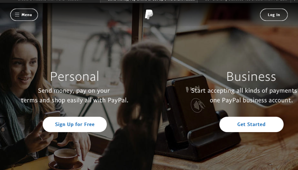 Source: PayPal
25. Don’t Forget to Say “Thank You”
Someone accepting your offer, signing up for your service, or making their first purchase with your company isn’t the end of the line. If someone went ahead and clicked your CTA, then filled out a form and processed a transaction, you owe them a thank you.
The Thank You page is a crucial part of the buyer journey. It can turn a one-time buyer into a lifelong customer. Your thank you page needs a confirmation of their purchase, and instructions for what to do next. Something like, “Thank you for your purchase! Please keep this confirmation number handy (insert #) and lookout for shipping updates!”
26. Have Someone Unsuspecting Take a Peek
Occasionally called “The Blink Test,” but more commonly known as, “Hey come take a look at this,” the point is you want someone who’s never seen the page to glance at it. That’s all, a glance. Then you need to ask them a series of questions, most importantly, “What was the page selling?”
Ask these questions:
- What do you remember from the page?
- Did you see the picture, the header, or the CTA first?
- Would you want to press the button?
These questions can help your designer understand what someone is getting from a glance at the page and what improvements they can make.
27. Make Yourself Visible
Making yourself visible through localization doesn’t restrict you from accessing a broader audience. That same technology that makes sure your pages appear in the right language, and your site places auto-dialed calls with the local area code can have other effects as well.
Those visiting your site can use dynamic text replacement to deliver personalized messages in headers, and other areas of the copy. Sites can accomplish this because they collected user data and matched it when that user needed to input it in another location. Using dynamic text replacement and localization with AdWords can help funnel clicks into the right landing page and showcase consistency with the personalization on your landing page.
Principles for CTA Design
CTA design changes the game for every landing page. If your CTAs are easily visible, don’t work, or don’t look like buttons, people simply won’t interact with them.
28. Move Your CTA
Your CTAs are the core element of the page, and a well-placed CTA could be more effective than a big and bold button. Make sure your CTA is hit regularly, but also, consider moving it.
Use heatmaps to track where people click on your page and try to center your CTA around the “hottest” points. You can also rely on eye-tracking studies to find the best spot on the page. Keep in mind that moving your CTA can also keep people from overlooking it if they view the page often.
29. Have Multiple Ways to Reach Your CTA
If you do have more than one link on a page, killing the 1:1 ratio, it should direct users right to the call to action. Use the space above the fold to highlight your CTA and spur interaction. Then, if necessary, use the remainder of the page to give your visitors additional opportunities to take that same action.
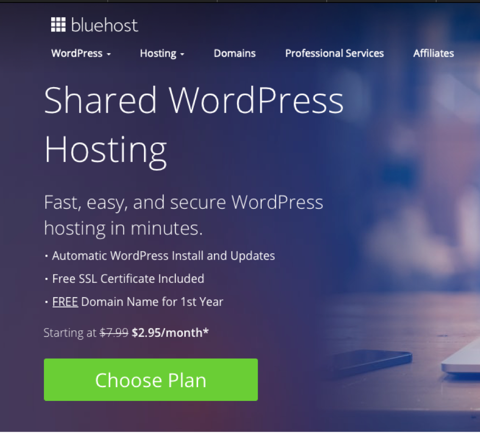
Source: BlueHost
Bluehost’s WordPress hosting page has five buttons on the page, all of which scroll the page to the same three columns with their available plans.
Source: Bluehost
Although there are multiple CTA buttons, they don’t navigate away from the page. Only these three selections will move a visitor forward.
30. Rethink CTA Design
All CTAs kind of look the same, they are square-ish, colorful, and often have white lettering. But, you should rethink that design. Create a list of negative words and change up your phrasing. Avoid things such as “click,” “join,” or “subscribe” for more modern versions such as “get,” “start,’ and “learn.”
Landing Page Creation and Technology
The availability of technology to help hone and develop landing pages is making the entire process easier and more effective. It’s a dream come true, and you shouldn’t miss out on the chance to use the technology available.
31. Use Heatmaps to Plan Your Page
Heatmaps allow you to see where people click on your pages most. There are always some natural click-patterns on a page.
Be sure to place highly visible CTAs over areas of your page that receive many clicks currently. You can use heatmaps to accomplish this, scroll maps, and confetti maps. All can help you identify how you can best arrange your content, images, buttons, and videos. that
32. Slash Your Load Times
Fear shouldn’t rule your landing page design process, but if it means losing out on 74% of visitors, then you should take action. Pages that take more than 5 seconds to load on a mobile site can lose up to 74% of visitors.
Slow load times will not only impact what your visitors think of your page and company, but it impacts SEO and SERP ranking as well.
Cut down your load times by choosing small images, removing videos, optimizing your images or videos, and making your JavaScript files external.
33. Have a Dedicated Mobile Landing Page
51.65% of all global internet traffic is on mobile devices, so if you don’t have a mobile-optimized landing page, then you’re missing out on more than half of internet traffic. Mobile traffic will only continue to increase as wireless, and services such as 5G coverage become more available. People are relying on 5G enabled devices for faster research and making purchases and more reliable connections.
While entering 2020, only have of webpages are optimized for mobile use.
Work with your designer or developer to optimize your mobile landing pages for checkouts and forms. Or, have an entire landing page only for mobile use. A dedicated mobile landing page is usually the better choice because you can remove elements that may be distracting on a smaller device that aren’t an issue on larger screens.
34. Continually Run A/B Testing
Many marketers will do an initial A/B test and then leave the page or ad alone. Don’t. A/B testing is an all the time thing like exercise and making good eating choices. Make a plan for running A/B tests are various times in the month or whenever you change campaigns. It’s less work than you realize as you can run an A/B test on a few landing pages, and then change the untested pages to what worked best as long as it aligns with the same market segment.
35. Monitor Your Benchmarks
It never goes without saying, your benchmarks, metrics, or KPIs require constant attention. Don’t check your benchmarks quarterly or annually, in the very least, check them weekly. If something on your one of your landing pages isn’t working well, then it needs an immediate change. External changes such as Google updates and changes to Facebook Ad algorithms can affect your pages too, and the only way to see that is through closely watching your page views and clicks.
Using these 35 best practices, you can continuously improve your landing pages, although it may seem like a lot of work many of these practices can quickly become habits rather than items on a checklist. You can also assign different elements to different people. For example, your designer doesn’t need to cover the content portion of this list, while your content writer doesn’t need to concern themselves with color theory planning.
Always give the greatest weight to what works best for you, and you can identify those elements through testing and monitoring. With proper planning and maintenance, your landing pages can lead your company to new levels of success.