Everyone is looking for a quick win when it comes to their website’s conversion rate.
Every. single. visitor on your website counts – especially with the increasing costs of PPC and paid social.
(You thought you were just the ones noticing that?)
No doubt you’ve heard the good ‘ol standby, that by simply changing your button colors to “red” it will make it rain!!!
It does not help that there are countless “gurus” out there who claim to take a geo-cities looking website and create millions of customers out of it.

Please don’t do this.
All kidding aside…
While we typically like to shy away from spouting out “generalized” feedback and blog posts, here are some “quick wins” you can take back to your team.
These are some of the elements we look at while starting an engagement with our customers – ensuring the foundation of the house is in good order before experimenting on significant design changes.
How do you know they will work?
Every website, application, and experience is different. But these elements have been tested time and time again by us, against millions of visitors.
Make sure to TEST these tactics yourself; you’d be surprised how these little things can affect the rest of your funnel – sometimes for the better but often for the worse.
Have a great idea we didn’t list out? Please share – we’re all about helping one another grow.
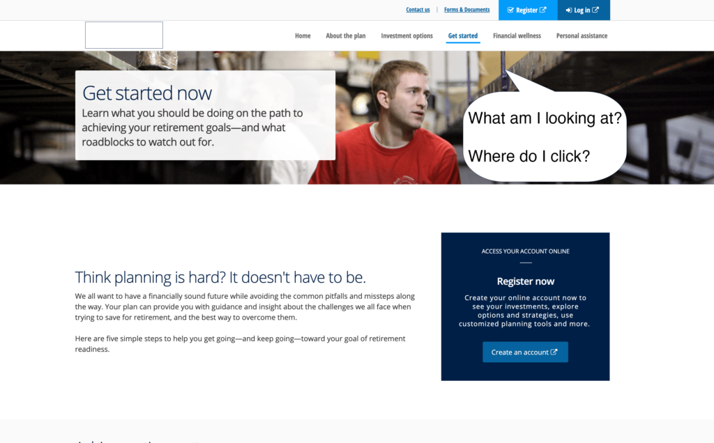
#1: Get Started (now):
Changing your call to actions to reflect what action the user will be taking is still critically important on any website.
While we’re long past the days of using “submit” as a CTA, we still see many websites not utilizing somewhat vague button text.
Take a look at WeWork’s homepage:

Start what?
Start a search?
Start a workspace?
Start revolutionizing my workspace?
While we do love that WeWork is using a verb on their button, providing a bit more context to what will happen next could work better.
What about trying out, “Start Search?”
#2: Move the CTA…ALL THE WAY UP 👆
Your website has one objective: Sell.
A visitor has taken time and come to your website – whether paid or organically.
Don’t make them hunt to give you their hard-earned money, or contact information.
There are still plenty of sites out there that don’t quite understand this. Take for example…
For goodness sakes, people – move the CTA up!
If you’re going to use people in your hero, be sure use the old trick of having them look at the button. Naturally, humans look where others are looking.
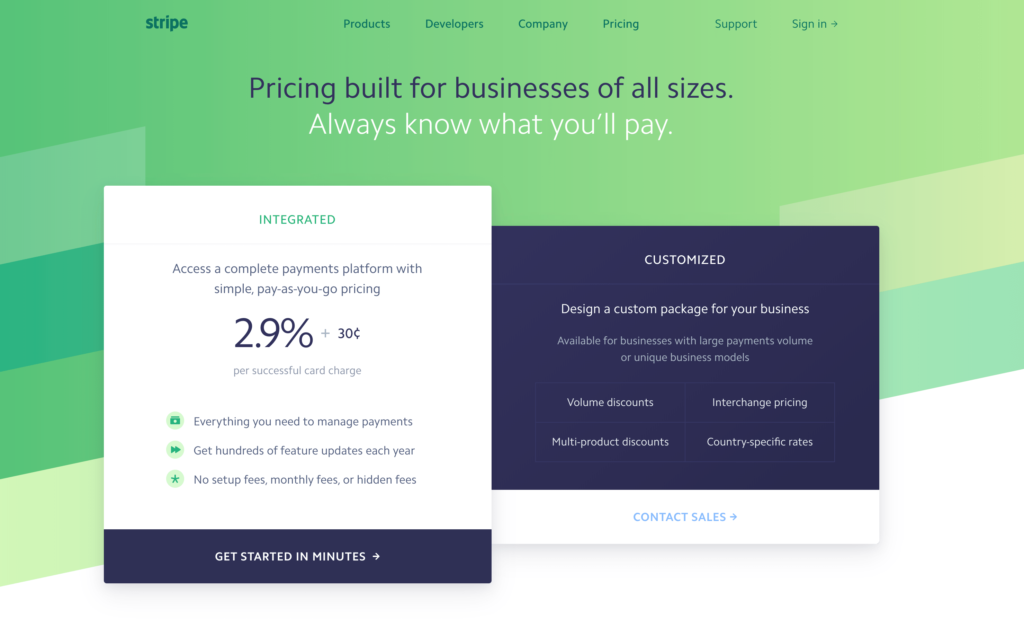
#3: Make the CTA Overtly Visible – (Sorry Designer Friends!)
We love Stripe.com. Beyond offering a great service used by millions, many designers take inspiration queues from their simple approach to design and illustration.
A website must look and feel unique, and of course, align to the almighty brand standards. But sometimes, push the boundaries in the name of conversions!
Take a look at Stripe’s pricing page (which we also analyzed in more detail here):
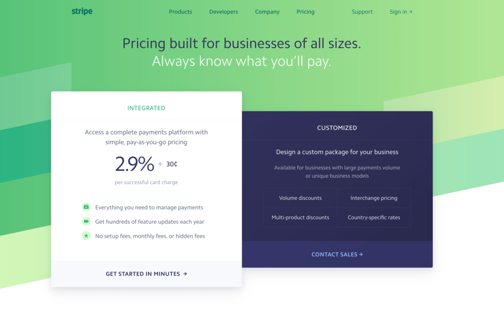
Does the CTA immediately jump out to you?
It took us a few seconds to understand what we were looking at on first glance.
What about changing the main CTA color to match the box to the right, then putting less emphasis on the contact sales button?
#4:What Do Your Breakpoints Look Like?
Simply put, a breakpoint is a screen dimension that will trigger a different view of a website.
For example, there are typically breakpoints for mobile, tablet, and desktop browsers.
Depending on how complex your needs are, sometimes mobile traffic is automatically diverted to a mobile version of your website.
(Pro tip: This is bad for SEO especially now that Google has mostly moved to mobile-first indexing)
Common frameworks like Bootstrap will automatically include these breakpoints on a best-practice basis.
But how does your website look? No really, how does your website look?
Don’t simply resize your website by making it smaller on your desktop. Load up your website and go through the purchase cycle on a cell phone. Try an iOS device, then Android.
If any of the views look a bit weird, or worse, don’t work at all, you know you’ve got a problem.
While this isn’t necessarily a “quick fix,” the solutions tend to be pretty straight forward.
To quantify and determine if these fixes are worth fixing, take a look at your analytics account follow these steps:
- Separate devices by “working” and “not working” breakpoints for the last 30 days. Make sure the conversions, conversion rate, and visits are included.
- In Google Analytics you can view this by going to Audience -> Technology -> Mobile -> Devices.
- If the list is too long, simply go to Audience -> Technology -> Overview to get a breakdown between mobile, tablet, desktop.
- Determine the conversion rate between the highest performing group and your broken group.
- Do the multiplication with the same traffic counts and see what happens!
While not a perfect science, this will help you estimate if the work required will be worth fixing. Often times, by layering in additional metrics like average order value, customer LTV etc., the picture can become even more clear.
#5: Why Are People Leaving?
As you are no doubt aware, most of the visitors to your website will not convert into a new customer or lead. If one of your channels converts at 100% – be worried!
Often times though, we get so fixated on trying to fix problems, there might be something obvious you’re missing that will unlock significant conversion wins.
There are a couple of ways to go about clearing your head and getting a fresh set of eyes on the problem.
Install Polling Software
This is easy in concept, but if not utilized properly it could create more problems with bad data. The premise is simple: On the pages people are dropping out of your funnel, ask them why.
The data you will back will be qualitative, but by flagging and categorizing you’ll quickly find trends of issues that you can address.
Our favorite tool to tackle this effort is Hotjar (no affiliation).
To actually execute on this endeavor, we would recommend setting up a trigger to ask a question while the user is displaying signs of “exit intent.”
The question can be as simple as, “Why didn’t you make a purchase today?”
You will be amazed at the feedback you’ll get.
Run a User Test
If you are categorized as a B2C business, we recommend running your website through a user testing session.
Some larger companies can do this for you with an in-house product marketing and UI/UX team, but for those not so lucky it doesn’t have to be complicated.
There are numerous sites that provide this service such as usertesting.com and userbrain.com.
Pricing is simple, typically anywhere between $15-$50 per user test.
Again the process is simple.
Set up your criteria for users to test your funnels. Typically you can filter based long technology aptitude, age groups, and income demographics.
Once you have determined the criteria for your ideal users, you can then set up instructions and questions for everyone.
Along the way, you will be able to watch their mouse moves, as well as hear their first-hand vocal feedback.
Pretty neat, right?
Check the Stats
If user testing isn’t your thing, look at your website’s analytics. You can set up some easy funnel analysis and pathing inside Google Analytics.
Take it a step further by adding “events” to every form field on your website. This will allow you to visually see what elements are causing breakage on your forms.
(Pro tip: HotJar, the tool we mentioned above, also has funnel analytics built-in which will help with this even further)
Remember. At the end of the day, users are people. Design and build websites for people. Click To Tweet
While some of the “quick wins” on our list might take more effort than others, it’s important to understand that the smallest little changes can actually have a substantial impact on your business.
What did we miss? Let us know. Or, get in touch with us and let us figure out some wins you can employ on your own website!