The pricing page of a website can make or break every SaaS business. For those companies that are able to convert highly, the rewards pay dividends, Every. Single. Renewal cycle. We discussed this in a fair amount of detail in our other blog post, “How 2 Small CRO Changes can ADD 50% to The Top Line”
For a SaaS company, successfully communicating your value proposition to users from your pricing page will not only help improve conversion rates, it should also help increase AOVs by pushing customers into higher tiered plans.
Want some inspiration for building a compelling pricing page? Let us tear down a few from some social media companies – you might have heard of a few of these.
Please Note: We don’t have any relationship with these companies, nor do we know what, if any, a/b testing or CRO work is being completed. The highlights and areas of improvement are all subjective based upon our experiences.
Mailchimp
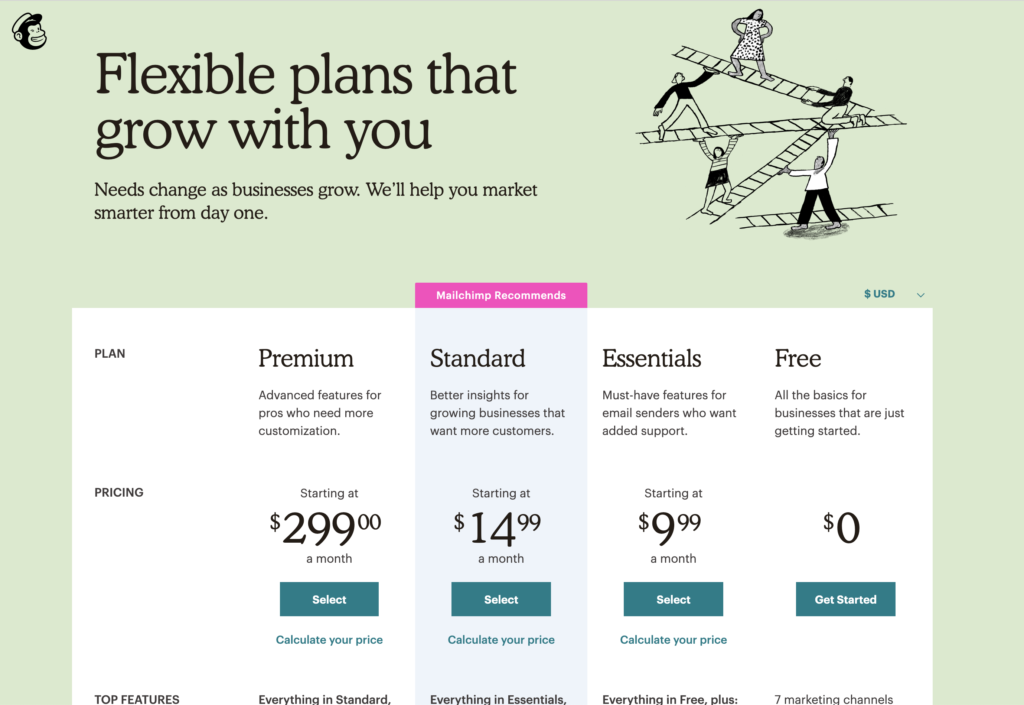
👌What we like about Mailchimp’s Pricing Page:
- The pricing grid is a mix of explanatory descriptions, as well as quantifiable metrics below the fold
- The price plans start from MOST EXPENSIVE to LEAST EXPENSIVE. This reversal of logic allows the customer to intuitively start reading on the best features – and see what they miss out by downgrading
- Smart highlighting with “Mailchimp recommends” as well as careful highlighting of important selling features throughout the page (New, Beta) bring points of interest close
- Visible, yet hidden hidden currency selector for international customers
💪How we would improve Mailchimp’s Pricing Page:
- All of the feature explanations on the pricing grid actually go to a separate page with a detailed explanation. We would suggest opening these up in modals with a quick explanation, with a ‘read more’ link in the modal for those looking for more information
- Mobile devices present a bit of a less streamlined experience. Depending on how much mobile traffic the site receives, this may or may not make a difference to the overall conversion rate of the site
- As the user scrolls, the plan as well as the all important “buy now” button disappears
- The buttons for all the paid plans utilize the CTA of “select” whereas the free version is “Get Started.” Would suggest testing various iterations of “Buy Now”, “Start Now” or “Try Now”
Washington Post
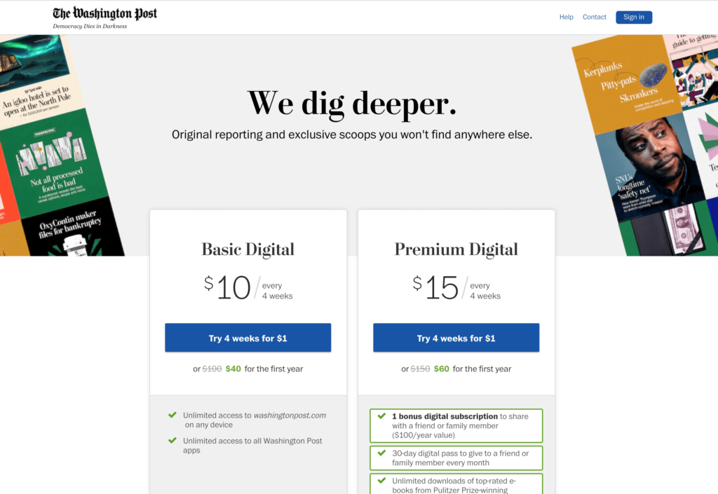
👌What we like about the Washington Post’s Pricing Page:
- Simple, simple, simple. Two plans to choose from makes this easy for the user to decide.
- CTA is “try” instead of “buy” allowing the customer to feel less of a commitment
- The “additional plans” are much lower on the page with great separation to keep the focus on the two featured plans.
- Though it depends on industry, having a live chat option on the pricing page is a smart addition to help answer any last minute questions.
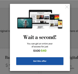
- The Washington Post is using an exit intent modal that actually is a more profitable offer than what is highlighted on the pricing page:
💪How we would improve Washington Post’s Pricing Page:
- The pricing boxes are too low on the page. Even on our test machine, a 13” MacBook Pro, the pricing plans were more than halfway down the page.
- We could not easily discern what was included on the premium plan without scrolling
- The additional features / bonuses on the premium plan are displayed in a less than intuitive nature. We would suggest keeping the same bullet points in the same order, and then highlight the additional features.
- This could be partly solved with moving the pricing box higher up
- The live chat has no sort of trigger that we could tell. We would suggest that if a user is dwelling on the page for more than 15-20s, open a live chat window proactively to answer any questions.
ExpressVPN
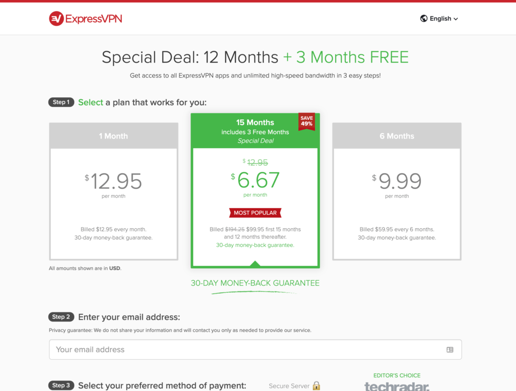
👌What we like about ExpressVPN’s Pricing Page:
- Pricing information is clear and the first thing the user notices – even above the headline (which itself is reinforcing the maximum term length)
- Incredibly short registration process. The payment/billing information does not show until the visitor makes a selection.
- Small visual indicators and labels such as “step 1” and “step 2” guide the user through the reg flow subconsciously
- Badges of trust by the payment area encourage completion
- Multi Language support, is on this page allowing a user to switch currency and language easily should they choose to do so
- Selecting any term besides the 12 month alerts the user the value they are missing out on as well as the loss of the 30 day money back guarantee
💪How we would improve ExpressVPNs Pricing Page:
- We would eliminate all footer links, and remove the link to the ExpressVPN homepage link in the header. These minor changes force the user to make selections versus navigating off the page.
- We were not able to trigger any sort of exit intent offer – these do work at generating incremental sales when implemented properly
- Because an email address is so important for registration, we would recommend implementing a cart abandoner sequence after an email address is entered with reminder and potential savings.
- Overall, the VPN market in general does an excellent job at pricing pages and conversion rate optimization – many SaaS companies should take a page from them.
Basecamp:
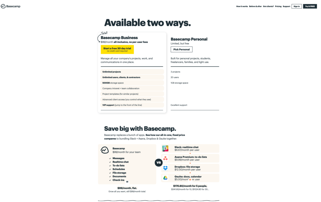
👌What we like about Basecamp’s Pricing Page:
- Hover effects for the buttons are opposite each other. This draws attention to the CTAs and encourages exploration
- The value proposition for the business plan eliminates risks due to not needing a credit card; additionally messaging is strong by focusing on value play of an “all-inclusive” offering.
- The plan features/benefits comparing the two plans are on the same rows which allows for quick comparison. Similarly, the upgraded features only available for business are listed in order of importance to the end user.
- The callout to “total” with an arrow on the very top of plan selector box comes into play / foreshadows what is further down th page when comparing all the other costs of individual competing services.
💪How we would improve Basecamp’s Pricing Page:
- At a first glance the page is overwhelmingly bold. Initially the page legitimately takes the user a few seconds to process what they are looking at on the page. This could be done on purpose, but also is a somewhat jarring. We would recommend playing with the treatments of the headlines, as well as margin/padding on the page
- There is no indicator to scroll down the page on desktop viewports. Adding an arrow indicator or some sort of icon would break up the page and give the user more direction.
- Scrolling down the page loses the plan selectors. Would recommend having some sort of mini sticky price selector box.
- Remove links to apps, and all other off-page information. Keep the user focused on the page.
- Highlight 2 months free on the annual terms higher in the pricing boxes; this would actually drop the price even further, thus increasing the value of Basecamp Business even further.
Stripe
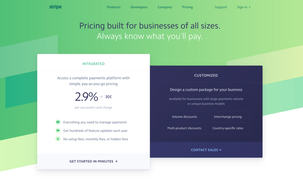
👌What we like about Stripe’s Pricing Page:
- The page is straight up sexy. The color scheme works well to highlight different elements on the page including background, plan boxes, and bullet points
- Reduced box sizing on the “customized” plan boxes most likely represents where most customers self select to start into Stripe.
- Crazy in-depth features listed below the fold for users to explore all of what is included on the stripe plan, including optional products and offerings.
💪How we would improve Stipe’s Pricing Page:
- The “get started in only a few minutes” CTA blends with the rest of the box. We would either add a border or make the button slightly darker to stand out a bit more.
- Similarly, we would make the entire pricing box clickable to get users to the next page of the registration flow.
- Similar to other brands on this roundup, we would add in an arrow or some sort of visual indicator to the user to let them know more content awaits below.
Hubstaff
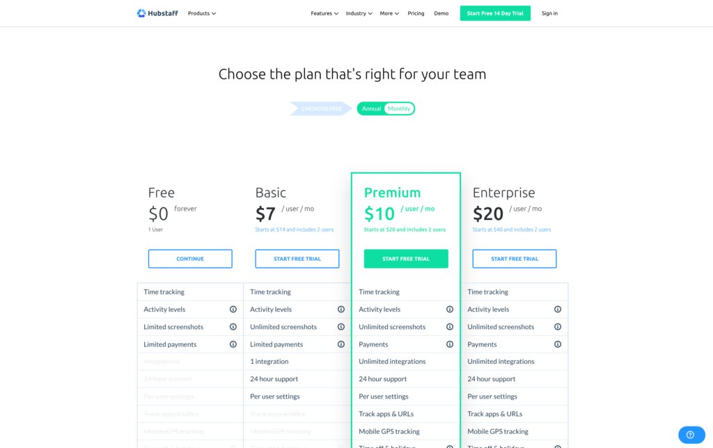
👌What we like about Hubstaff’s Pricing Page:
- Overall the page features simple, clean, and smart design which utilizes white space very well. The call to action color is green, period
- The first thing the user sees below the headline is a selector for term length which instantly displays the value by shifting up to an annual term
- The grid grays out all the available features on each plan. This allows the the user to visually see what features they are missing out on by not upgrading.
- All features have tooltips vs. moving to a new page for more clarification on what each item means.
💪How we would improve Hubstaff’s Pricing Page:
- The “recommended” plan is off-center which we find slightly jarring. We would recommend finding a treatment to move this more center aligned and reducing the amount of real-estate on the free plan.
- Trust badges, including a 60 day money back guarantee should be moved up above the grid. These can be implemented so as to minimize screen real estate.
- There is a tremendous amount of white space between the title text, plan selector, and table which could be minimized to bring everything up on the page. While the “fold” doesn’t exist anymore, smart spacing still can go a long way.
- The Call To Action (CTA) for free is simply “Continue.” This doesn’t sound very encouraging or welcoming. “Start Now,” for example is a bit more soft.
Teachable
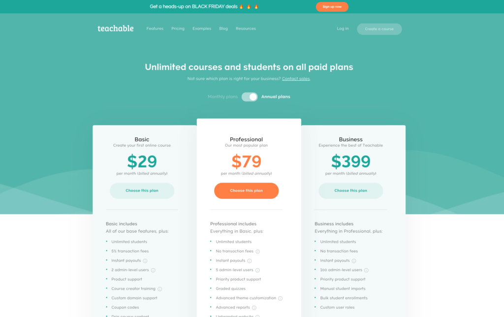
👌What we like about Teachable’s Pricing Page:
- Very clear and distinct pricing table separated out from the rest of the page via coloring and grist layout. You know you’re in the right spot.
- The professional (and subsequently most recommended plan) is in the middle of the grid with distinctive highlighting.
- The term length selector is front and center allowing the visitor to customize the plan and easily see the savings.
- Strong testimonials are featured below the grid to encourage purchase.
💪How we would improve Teachable’s Pricing Page:
- The FAQ section of the page takes up a large amount of space. Would recommend minimizing them and then showing content if selected.
- There is no exit intent on this page; even if Teachable is not able to offer a discount on their pricing, they should highlight some aspect or feature that is unique to their platform.
- There is no live chat option available on the page. With new “AI Bots,” available, even without a live chat operator, many questions can be answered automatically.
There you have it! 7 great pricing pages from all types of SaaS companies with some ideas you can probably use as you’re designing your own pricing page.
As a reminder we have no relationship with any of these companies, therefore all of our ideas, feedback, and criticisms are based on our own best guesses – there is only one way to know for sure if these ideas will work. (That is, to test!)